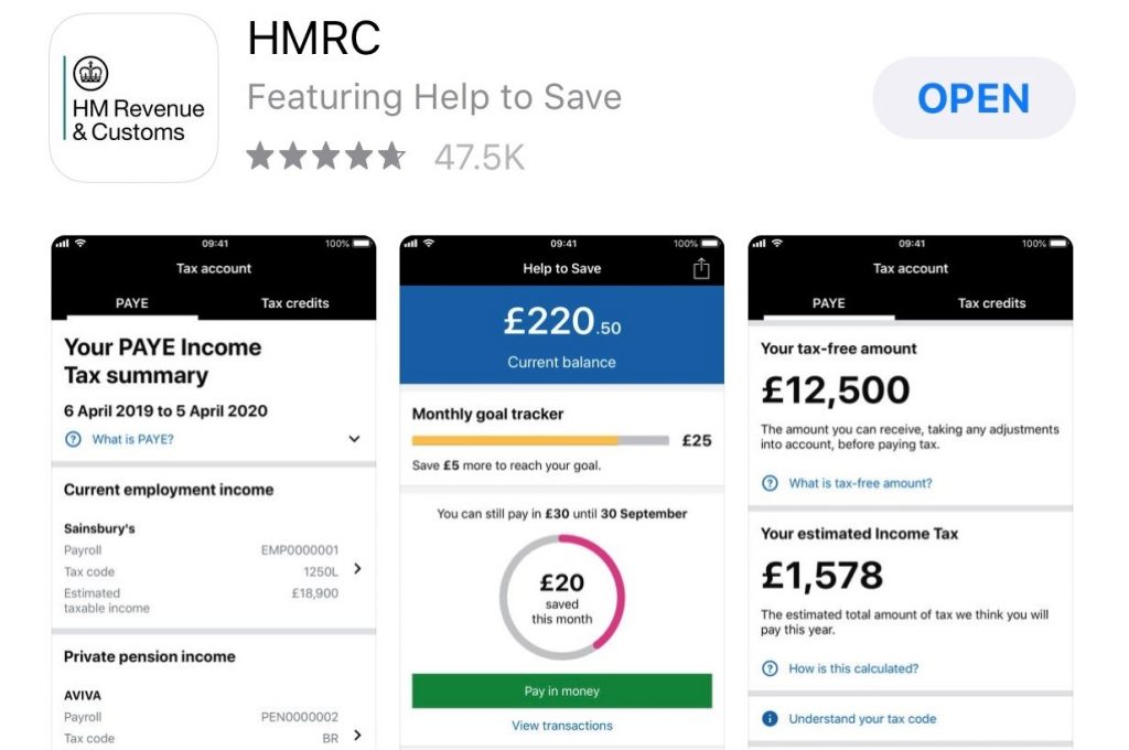
I joined the mobile app team in April 2018 as an interaction and product designer. This blog is about my team's work to extend the GOV.UK Design System to include guidance for creating native apps.
GOV.UK Design System
Before joining the team, I was aware of the award winning GOV.UK Design System, a series of guidelines created by the Government Digital Services (GDS) to help all departments to keep everything published on the GOV.UK website consistent. But, I didn’t know about the HMRC mobile app, which lets people check their personal tax and tax credit accounts, update details, and alert us to changes without having to pick up the phone.
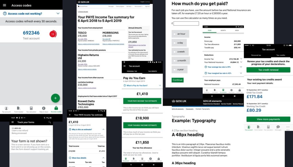
The GOV.UK Design System was written for the creation of GOV.UK web pages so, when the app was developed, finding guidance on which design or interaction patterns to use wasn’t easy because of the differences between GOV.UK and native mobile operating system patterns. As a result the design and user experience of the mobile app had ended up less standardised than the web and there were even some differences between individual pages within the app itself.
Native mobile
It’s at this point we decided we needed to extend the GOV.UK Design System to accommodate designing for our mobile app. We had the mobile-responsive GOV.UK Design System and the HMRC design patterns as a guide to work from, but they weren't designed for native mobile.
We needed to build a more native mobile app experience - to reduce noise and provide the same detail and functionality making it easier and quicker for customers to update their information. This was an opportunity to improve the user experience that responsiveness alone doesn’t always solve.
How we did it
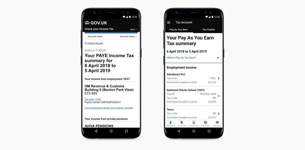
We started with an audit of the patterns in the app and those on the web. Where we could, we created similar patterns to GOV.UK, as well as creating new native ones when we needed to.
With the GOV.UK Design System, you can design and build using a prototyping kit with all the styling and components built into it. But, we didn’t have that for native mobile, and we didn’t have a method for getting designs from Sketch to Android and iOS, either. That meant we were going to need a design UI kit, another for Android and iOS developers, and some way of keeping everyone in sync.
We already use Invision for prototyping user journeys in the app and we can easily publish from Sketch to Invision with Craft. So, using what we already had, we created and published a mobile set of guidelines that everyone could refer to. Developers could use Invision Inspect to reference any specific details, and we could share what we were doing across the rest of the organisation.
Uninterrupted service
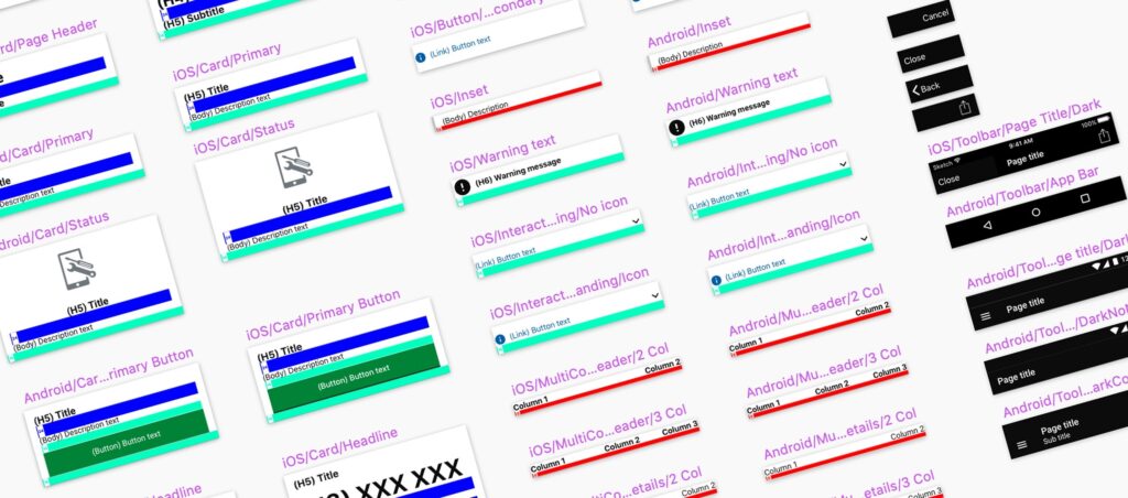
To ensure we could test that each component in the design system worked as expected, we created companion apps to run alongside the guidelines. These companion apps meant that we could test components on devices independently from the main app, and ensured our users were not affected because new components were not pulled into the main app until we had thoroughly tested them.
This new way of working is more streamlined and means we can design, build and test much more quickly and robustly. Also, if we make a change it updates across the whole app, ensuring a consistent user experience.
Accessibility
We also needed to make sure the app is accessible to everyone. This means designing, developing and testing design patterns and components that work with a phone’s assistive technologies at every step of the journey.
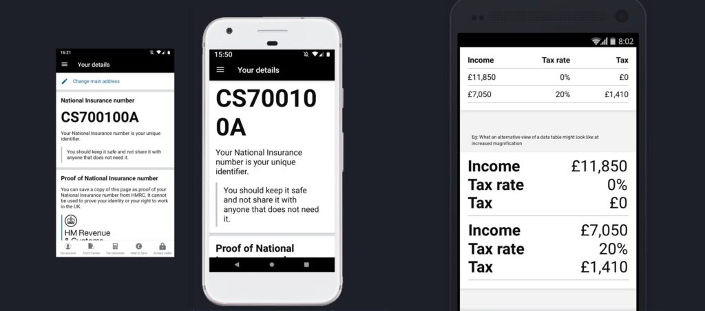
The Mobile App Design System released
We released version 1.0 of the Mobile App Design System at the end of November 2018. Since then we have implemented it across several parts of the app including Tax Credits, Help to Save and, most recently, Pay As You Earn. We’re still ironing things out, learning and improving as we go but the new process and way of working seems to be bedding in.
What else have we achieved?
To sum it up: we talk more. We schedule a weekly meeting between design, development and testing teams to talk about anything happening cross-team that might impact the components or design system. We also spend a lot of time speaking with our users to understand what they need, what works and what doesn’t.
On top of this, there is a strict process for adding or modifying components, and a sign-off process to follow which includes checking-in with other disciplines. Everyone in the team is accountable for the way things look and function, with designers and developers pairing when designing and creating new components
We are constantly building, evaluating and working hard to make things better. Of course, things will change: this will be one of many extensions of the Design System. But the process of involving and talking to each other more will help us scale and extend it well into the future.
If you have experienced similar problems it’d be great to hear how you and your teams solved them. Just leave us a comment below.
Marc
Check out our current vacancies. They're updated regularly so worth keeping an eye on.
Now you can follow us on Twitter @HMRCdigital
To make sure you don't miss any of our blog posts, sign up for email alerts
2 comments
Comment by Marc Belle posted on
Hi Jack
Thanks for your comment. We are aware of this and have been working on adding a delete Access codes function to the app following customer requests so you can expect to see this available in the next release.
Comment by Jack posted on
There is quite a big issue with the mobile app, which really needs resolving.
When you go to access codes, if one of the access codes are wrong, you can't delete the access code from the list.
I have numerous codes that need deleting, but there is no option in the app.