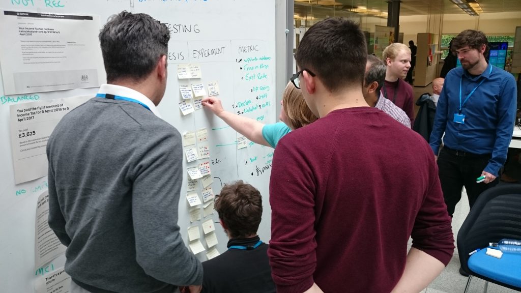
 Hi, I’m Jennifer Scott. Earlier this year I blogged about how we were introducing A/B testing at HMRC to improve digital services for our users. Now it’s well and truly embedded into our agile processes and I’m back to tell you a bit more about how we develop the tests.
A/B testing is a quantitative user research method that compares two versions of a page or design element on a website in a live experiment. User research is a team sport that is most effective when user researchers are embedded in service delivery teams and team members actively participate in user research activities.
A/B testing is also a team sport. It might sound more technical than other types of user research but the principles behind this technique are found in other methods, like usability testing.
Idea generation workshops
To identify potential A/B experiments at HMRC, our multi-disciplined scrum teams hold workshops to answer questions about their service, for example:
- What are our users' pain points?
- What issues have we found during usability testing?
- What do performance analytics tell us about the current journey?
Screenshots of the service are printed off to create a journey map on a whiteboard. Sticky notes are added to show evidence of pain points at each step in the user journey. A pain point is a problem in a service that may be causing users frustration or stopping them from completing the online journey.
We can find evidence for pain points in Google Analytics. For example, high numbers of users dropping out at certain pages or form fields that trigger lots of error messages indicate to us that something’s not working as well as it should.
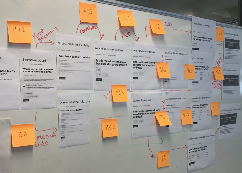 We make pain points visible on a whiteboard so we can discuss them as a team. Each discipline on the team contributes their ideas on how to improve the service. This can prompt interesting conversations about future usability testing, improved web page tagging or product improvements for the backlog.
Start to design hypotheses
Using a table on the whiteboard is a simple way to build a hypothesis for each problem. We use columns to show the assumed problem, potential solution and how success will be measured.
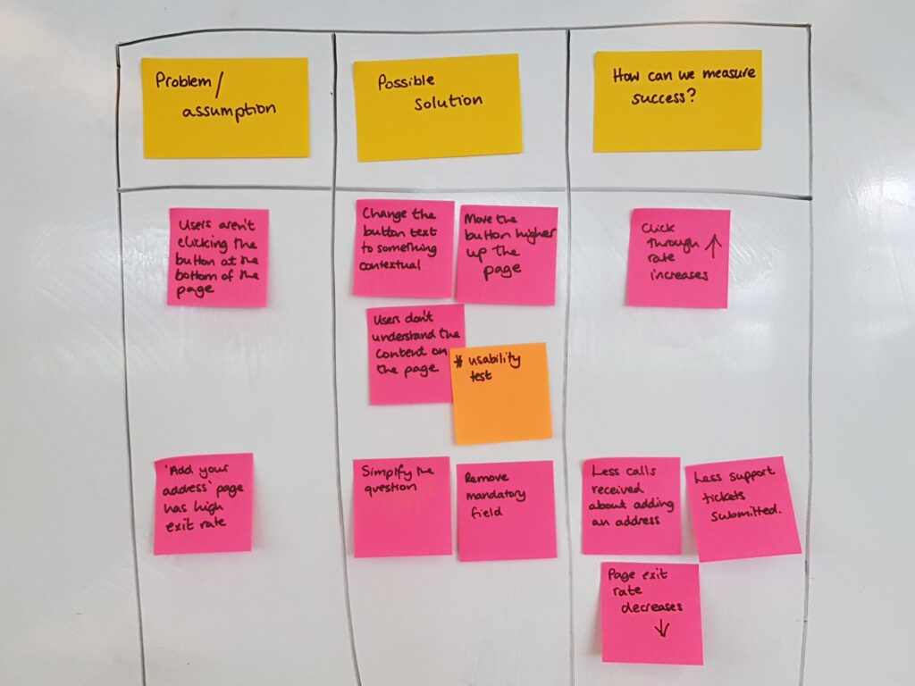 The post it notes in these columns form the building blocks of a hypothesis:
- We believe that…[the problem]
- So if we… [the proposed design solution]
- We will see… [the measure of success]
Prioritise ideas for an experimentation backlog
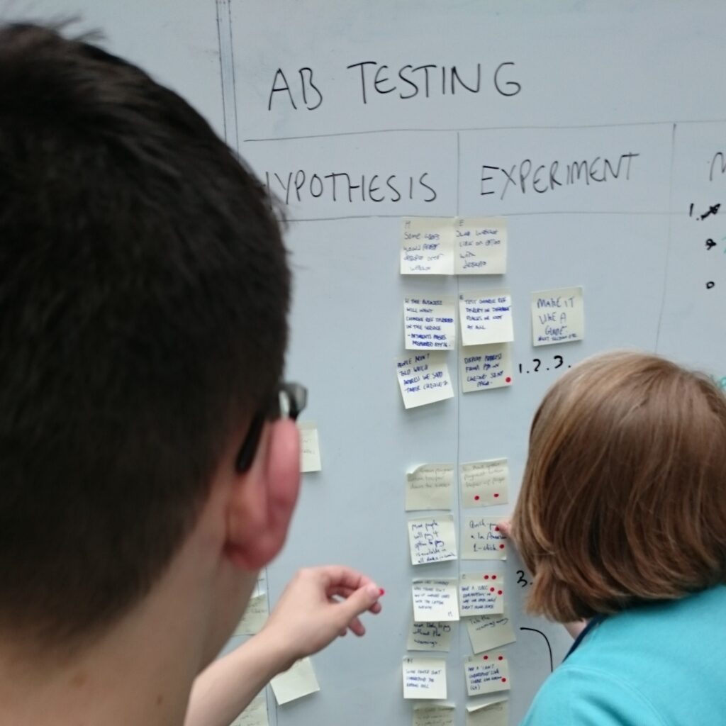 As a team we then use dot voting to prioritise and agree the experiment ideas.
Learning and improving
The proposed solutions are designed and then we trial them alongside the original webpage or design element in a live service. In an A/B test 50% of users will see the original design and 50% will see the variant design.
We usually run experiments for 2 weeks to allow for peaks and troughs in visitor numbers or unique events such as bank holidays. At the end of the experiment the measure of success (like number of clicks or exit rate) is compared to the original design to see if there has been a significant difference.
The design we trialled could be better or worse than the original - either way we have learnt valuable insight to improve services for our users.
In previous experiments we’ve seen a 1.9% increase in completion rate of the Marriage Allowance eligibility checker and a 2% increase in people viewing their upcoming tax credits payments on mobile. A small percentage increase could equate to thousands more customers completing an interaction with HMRC online.
Our future plans
We want to work with more scrum teams to improve services and share what we’ve learnt with other government departments. Look out for our future blog posts about how we’re using hypothesis driven experiments at HMRC.
Jennifer Scott, Senior User Researcher
Check out our current vacancies. They're updated regularly so worth keeping an eye on.
Now you can follow us on Twitter @HMRCdigital
To make sure you don't miss any of our blog posts, sign up for email alerts